

Menu
By theme
By theme

{{ variable.name }} : {{ variable.values[selectedVariantsIndex[variable_index]].name }}
Quantity:
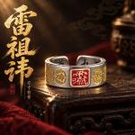
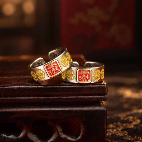
The two characters Leizu sound like one deity, but they name the head of the thunder department, whose full title is the Nine Heavens Responding Prime Thunder Sound Universal Transformer Heavenly Worthy. Temple images of Leizu are stern, holding an implement, with thunder generals ranged on either side. His hui character is not written like an ordinary one: the strokes are stacked, outsiders cannot read it, and anyone who knows it identifies the deity at a glance. His birthday is fixed in folk custom, and the temple is at its busiest that day. The number of generals flanking him in his hall is not fixed.
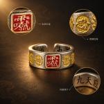
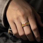
Carving a hui character on a ring means arranging it around a circle. Chinese strokes run horizontally and vertically, and once wrapped into a ring the horizontals become arcs while the verticals splay outward; handled badly, the skeleton of the character goes. Rings of this kind therefore use a single hui repeated around the band, or enlarge one character until it fills the face. Enlarged, the way the strokes stack has to be made clear, or the result is a blot of ink. In a one-character composition, the empty space is harder to judge than the strokes.
Men's and women's versions differ in the width of the face. The men's is wide enough for the characters to spread out; the women's is narrow, so it can take only part of the character or thinner strokes. Choose by the thickness of the finger rather than by gender, which is the more practical rule. Position matters too: the women's version usually goes on the ring finger, the men's on the index or middle. Short fingers under a wide face look shorter still. Measure with a strip of paper, not string, which stretches. A wide band holds its own; a narrow one lengthens the hand.
The cold white of white copper looks clean against dark clothing and dirty against bright red or green. A text ring is dense with information, so don't pile other ornaments onto the same hand. Two at most on one hand, ideally one wide and one narrow, and not both engraved. White copper is not particular about gender, but it clashes with gold, and against silver it is worth watching for colour transfer; on days when your cuffs are pale, move it to the other hand.
Copper oxidises, and the lettering darkens before the face does. That order makes the text clearer, so there is no need to rush at it with a cloth. If you do wipe it, use a soft cloth along the band rather than a toothbrush, whose bristles catch in the strokes. Soap left in the lettering dries into a white frost, so rinse it out, and clear dust from the strokes with a dry soft brush. Worn long, a bright band appears inside the ring where the knuckle rubs. It does not wipe off, and it does not affect the wearing.