


Menu
By theme
By theme




{{ variable.name }} : {{ variable.values[selectedVariantsIndex[variable_index]].name }}
Quantity:
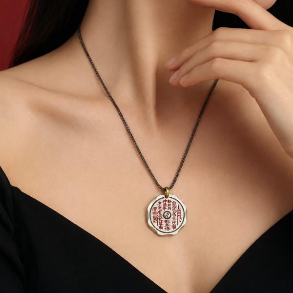
The red lettering is what separates these two versions. Colour is filled into the cuts, and red on a dark ground looks like a seal impression from a distance. Filling is not hard; filling evenly is. Cut too deep and the red pools at the bottom; too shallow and it will not hold, and it comes off after a while. Once filled, the face is wiped to take off what spilled outside the cuts, and wiped too hard it takes the red out of them as well. There are several reds: a true red runs bright, a dark red looks older. The two versions use different ones, which you can see when they are side by side.
Gold and silver are two different grounds. The gold is warm, and the red sits heavy on it; the silver is cool and the red jumps, like an old New Year print. Under a lamp the difference is small. In daylight at the doorway, the gold leans towards brass and the silver towards lead white. Darker skin sits easily with the gold, and a fair complexion looks cleaner with the silver; that is not always true, but it beats choosing blind. The red on the gold version has to go a shade deeper — too light and it will not lift off a warm ground, and from a distance there is only a field of yellow.
The face of the round plaque carries the mountain-ghost spell, the characters set round the border with the centre left empty. The empty centre is not laziness; it gives the characters room to breathe. The back carries the bagua, and the yin and yang lines must be clear — a broken line, or two fused, drops the work a grade. A ring of flat ground should separate the characters from the rim; without it they look stuck on. People do take that empty centre away to be engraved. Once engraved it is no longer a charm coin, and that should be said beforehand.
Plaque alone, no chain, hole at the top. It is not thick, so at the chest it lies against the skin, and in a sweaty summer the red suffers first. If that concerns you, take the silver version: faded red shows clearly there and is easy to touch up. On the gold, faded red blends into the ground and stops being noticeable, which is worse. Touching up means refilling the whole face; patch one spot and the colour will not match. The red dislikes rubbing, so do not scrub the cuts with a cloth. Each scrub takes a layer, and no touching up brings it back. After a summer day, press it with a dry cloth rather than wiping back and forth: pressing lifts the sweat, wiping rubs the red away.
Many people talk about charm coins and few get them right. It is a folk coin, it never circulated, the face is a spell and the back is a hexagram; those few sentences, said accurately, are worth more than a heap of stories. The ground colour of white copper shifts with sweat — the gold version darkens, the silver warms — and both are oxidation. Some customers seek out the darkest, saying that is what something kept at the bottom of a chest looks like. Set the two side by side and the reds differ in depth. That is not a colour mismatch; it is the judgement of what each ground needs.