


Menu
By theme
By theme



{{ variable.name }} : {{ variable.values[selectedVariantsIndex[variable_index]].name }}
Quantity:
Ask ten people which five gods make up the five directions of wealth and you will get three answers. One arrangement puts Zhao Gongming at the center, with Zhaobao, Nazhen, Zhaocai and Lishi holding the four quarters. Another sets Wang Hai, Bi Gan, Chai Rong, Guan Yu and Zhao Gongming each in a direction. Both are believed, and both have their temples. Traders do not much care about the genealogy; what they want is east, west, south, north and center, every road accounted for, and the busiest incense at the New Year is not always burned to the same god. The two words themselves first meant the roads of the four quarters plus the middle, not five deities seated in order.
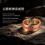
What is cut into this ring face is not a likeness but a taboo name. Daoism writes certain divine names in a form that defies normal character shape: stroke stacked on stroke, unpronounceable, recognized only by its outline. These are the taboo names. They are written on talismans and seals and cut into command tablets. One character often packs a dozen strokes into a small space. The graver runs straight lines and the corners have to come out clean; smear one stroke and it is a blot. Five of them side by side must each keep their ground and not collapse into a column. A taboo name is not to be read aloud — to read it is a transgression. That is the rule of the gate.
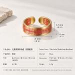
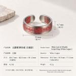
White copper runs cold, so the hollows are left dark and the raised faces polished, and the characters float up out of it. Five around the band have to be even in size. The two beside the join are the ones that get squeezed flat, so the divisions are measured out when the master is made. The face is narrow; the cutting can only go so fine before the characters stop being recognizable, and unrecognizable defeats the purpose of cutting them at all. Some people object that they do not look like characters. They were never meant to be read. A line of white is left between them; packed tighter, the face reads as a floral plate.
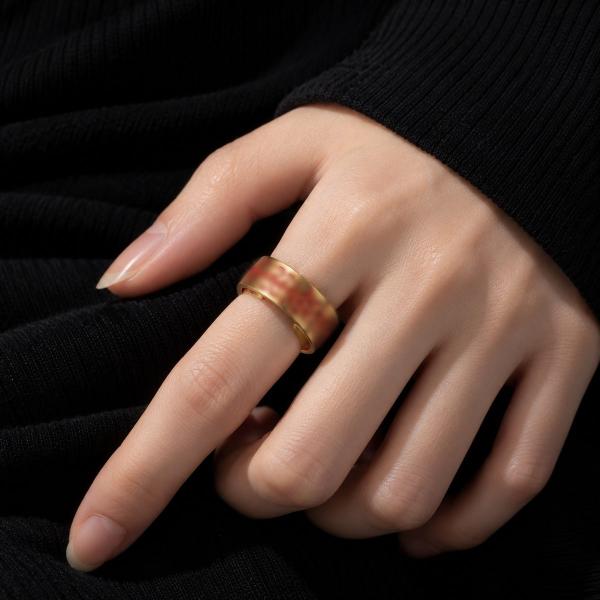
The gap of the opening falls between two characters, never across a stroke. That position has to be chosen with care: a gap running through the middle of a character ruins it. White copper has spring. Pry it open, slip it on, and it comes back to sit at the base of the finger without pinching. Yellow or white: yellow is warm and goes with dark clothes, white is cold and looks clean on the back of the hand in summer. Choose by the hand, not by the wardrobe. The gap faces the web of the thumb, where it will not rub the palm.
A copper ring does not mind water; it minds the salt in sweat. Wear it through a summer day and the inside dulls, and a dry cloth brings it back. Do not pick the dust out of the strokes with a needle; scratch them and the cutting blurs. Keep it by itself, not loose in a pocket with keys. One knock rounds the edge of a stroke, and a rounded stroke can never be cut back. Worn long, the ring loosens half a size, which suits a thicker finger better than a thin one. The yellow version reddens with age and the white turns blue-green; each takes its own road.